ROLE
Brand Strategy
Market Research
Visual Identity Design
TIMELINE
5 Weeks
November 2025
TOOLS
Adobe Creative Cloud
Figma
Procreate
Defrosting Menchie's: A Rebrand
U OVERVIEW
Context
I was tasked to create a brand strategy and new visual identity for a brand that could improve its market presence. This rebrand is not in affiliation with Menchie's.
U BRAND ANALYSIS
A family friendly brand built around joy and connection
Menchie’s target demographic is families, children, teens, and young adults—anyone who enjoys sweet treats in a cheerful social environment. Frozen yoghurt is popular for casual outings, social gatherings, and family-friendly occasions.
U THE PROBLEM
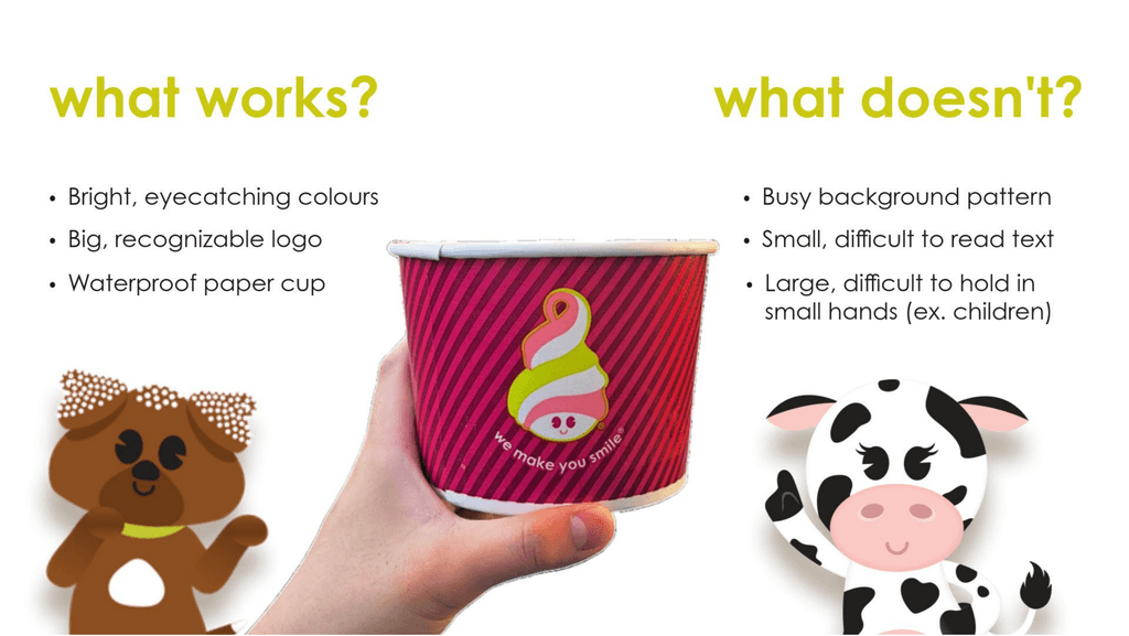
Outdated and Illegible
Menchie’s target demographic is families, children, teens, and young adults—anyone who enjoys sweet treats in a cheerful social environment. Frozen yoghurt is popular for casual outings, social gatherings, and family-friendly occasions.
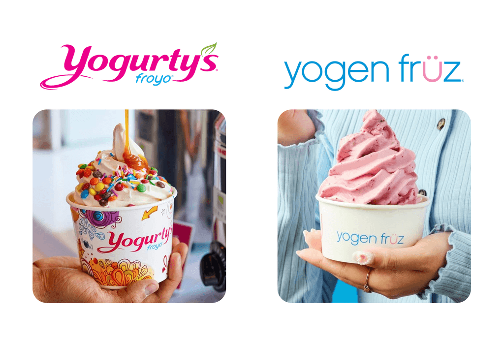
Competitor Analysis
To understand the current industry, I compared Menchie's to competitor brands that appealed to the target demographic I identified.
I analyzed Menchie’s two main competitors, Yogen Fruz and Yogurtys, with a particular focus on Yogen Fruz. Yogen Fruz has a strong, minimalist brand identity, with clean packaging that aligns well with the “clean girl” aesthetic popular among teens and young adults. It also maintains a clear and recognizable visual system, and actively engages audiences through Instagram Reels and trend-based content.
U PROBLEM STATEMENT
How might we reimagine Menchie's brand identity to connect with both nostalgic families and a new generation of teens while keeping its playful spirit?
U NEW IDENTITY
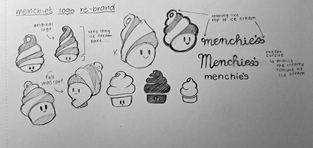
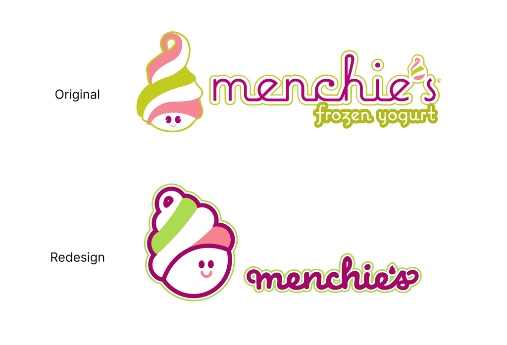
Rounding and Simplifying
I began with simple sketches of the original logo, tweaking it bit by bit to align with the vision of a more modern design through rounded edges and stronger shape language. I wanted the logo to be built from circles, which are known for their friendly shape language and resemblance to the swirl at the top of an ice cream cone. I also carried this theme into the wordmark by adding looping forms to the beginning and end of the type.
U SOLUTION
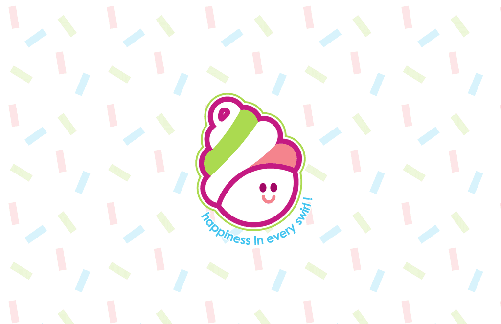
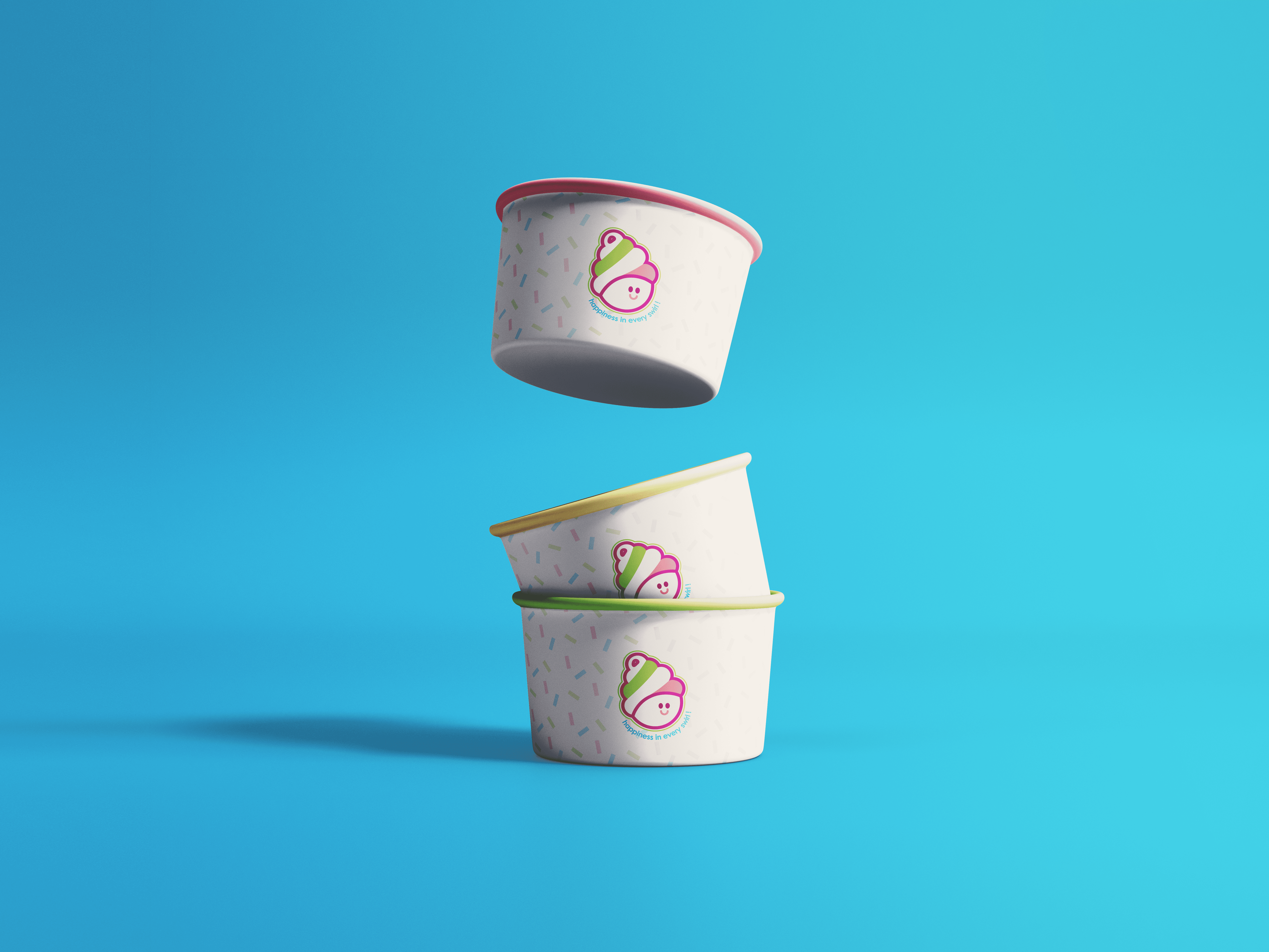
Final Design
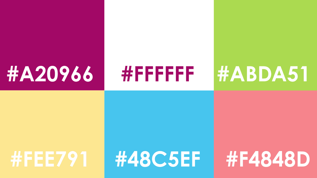
The new branding is clear, memorable, and approachable for both children and adults, featuring simplified visuals and a bold palette of saturated colours. I only made minor adjustments to the original colour scheme, mainly to improve visual comfort, since the existing colours are already highly recognizable and iconic.

U REFLECTION